
Check-in Widget
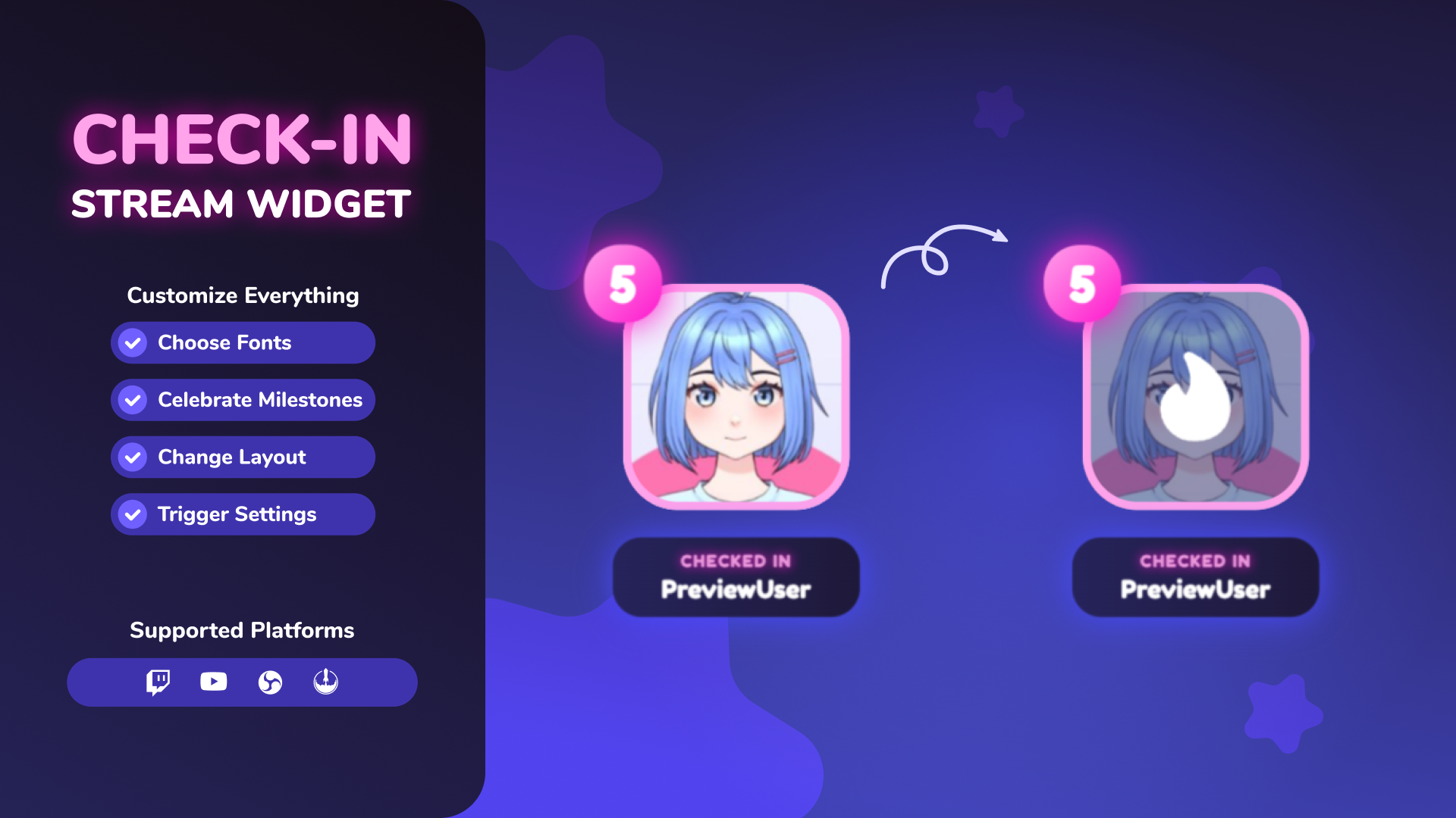
Thanks for downloading our widget!
Here you will find instructions on how to set everything up and an in-depth description of its possibilities.
⚠️ Take note: This widget is hosted on StreamElements and works only with Twitch
Widget Installation
- Log in to StreamElements with your Youtube or Twitch account
- Go to the “2. Widget” folder in the package you’ve downloaded
-
Pick the file that corresponds to your streaming platform (Twitch or YouTube) and double-click to install it.
Voila! Your widget is installed!
Widget Customization
-
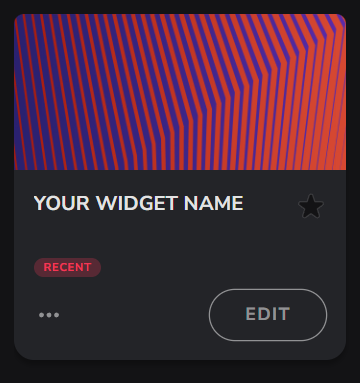
Pick your widget in your StreamElements dashboard and click “Edit”
-
Click on “Layers” and go to your widget.

- Go to the “Settings” tab


Customization Fields
👁️ Visibility Toggles
| Name | Description |
|---|---|
| Show Counter Badge | Toggle the visibility of the check-in count badge. |
| Show Name Badge | Toggle the visibility of the name/username pill. |
| Show Sparkles | Toggle the sparkle particles when checking in. |
🕹 Trigger Settings
| Name | Description |
|---|---|
| Redemption Type | The trigger type: Command (triggers on chat command), Keyword (triggers when message contains word), or Channel Reward (Twitch only, triggers on channel reward redemption). |
| Channel Reward Name | Name of the Twitch channel points reward that triggers the widget check-in. |
| Command Name | Command viewers type in chat to trigger a check-in (e.g., !checkin ). |
| Keyword Name | Keyword contained in chat messages that triggers a check-in. |
⚙️ Logic Settings
| Name | Description |
|---|---|
| Count Mode | Track cumulative visits (Normal Count) or consecutive visits (Streak Count). |
| Reset Mode | Frequency of global check-in count resets: Daily, Weekly, Monthly, or Never. |
| Reset Day (Weekly) | Day of the week when the check-in count resets (only applies to Weekly Reset Mode). |
| Reset Time (Daily) | Target time (24h format HH:MM:SS ) to reset check-ins every day (only applies to Daily Reset Mode). |
| Streak Grace Window | The window in hours within which a user must check in to keep their streak active. |
| Display Duration | Time in seconds that the check-in graphic stays on-screen. |
| Cooldown | General cooldown period in seconds between check-in notifications to prevent chat spam. |
🏆 Milestones
Milestones display celebratory custom banners when viewers hit a specific number of total check-ins.
| Name | Description |
|---|---|
| Milestone Counter Gradient Start | Start color of the milestone bubble's gradient background. |
| Milestone Counter Gradient End | End color of the milestone bubble's gradient background. |
| Milestone Value Color | Text color inside the milestone bubble. |
| Milestone [1 - 4] | The check-in target counts to trigger Milestone celebrations levels 1 to 4. |
| Milestone [1 - 4] Label | Custom celebratory labels displayed next to the username when milestone triggers. |
🎨 Stamp Design
Stamps are stamped overlays shown on top of the viewer's profile picture upon checking in.
| Name | Description |
|---|---|
| Stamp Design | Overlay design to stamp. Options: None, Random, Heart, Fire, Moon, Melody, Star (Sparkle Blob), or Custom Image. |
| Custom Stamp Image | Upload a custom graphic to be used as a stamp (only applies when Stamp Design is set to Custom). |
| Stamp Color | Custom tint color applied to standard vector stamp designs. |
📛 Name Badge Settings
| Name | Description |
|---|---|
| Name Badge Position | Position of the name badge relative to the avatar: Above Avatar or Below Avatar. |
| Name Badge Gradient Start | Start color for the name badge gradient background. |
| Name Badge Gradient End | End color for the name badge gradient background. |
| Name Badge Stroke Color | Border color of the name badge. |
| Name Badge Glow Color | Glow/shadow color for the name badge. |
| Name Badge Stroke Width | Border thickness of the name badge. |
| Name Badge Roundness | Corner rounding radius of the name badge. |
| Name Badge Glow Blur | Glow blur radius for the name badge. |
📝 Text Settings
| Name | Description |
|---|---|
| Regular Check-in Text | Status label text for regular check-ins. |
| Streak Check-in Text | Status label text for streak mode. |
| Main Text Color | Color of the viewer's username. |
| Label Text Color | Color of the status label text. |
| Label Text Glow Color | Glow color for the status label text. |
| Label Text Glow Blur | Glow blur radius for the status label text. |
👤 Avatar Settings
| Name | Description |
|---|---|
| Avatar Stroke Color | Color of the border surrounding the user's profile image. |
| Avatar Glow Color | Glow color for the avatar frame. |
| Avatar Stroke Width | Border thickness of the profile picture frame. |
| Avatar Roundness | Corner rounding radius of the profile picture frame. |
| Avatar Glow Blur | Glow blur radius for the avatar frame. |
🔢 Counter Settings
| Name | Description |
|---|---|
| Counter Position | Corner position of the counter badge: Top Left, Top Right, Bottom Left, Bottom Right. |
| Counter BG Gradient Start | Start color for the counter badge gradient background. |
| Counter BG Gradient End | End color for the counter badge gradient background. |
| Counter Text Color | Color of the check-in count text. |
| Counter Stroke Color | Border outline color of the check-in count badge. |
| Counter Glow Color | Glow color for the counter badge. |
| Counter Stroke Width | Border thickness of the count badge. |
| Counter Roundness | Corner rounding radius of the count badge. |
| Counter Glow Blur | Glow blur radius for the counter badge. |
📏 Typography & Scale
| Name | Description |
|---|---|
| Primary Font | Google Font family used for all typography on the widget. |
| Font Weight | Font weight of the primary text (e.g. username). |
| Highlight Font Weight | Font weight of the highlighted text (e.g. labels). |
| Username Font Size | Font size of the viewer's username. |
| Label Font Size | Font size of the action/milestone status text. |
| Count Font Size | Font size of the counter badge number. |
| Global Widget Scale | Scale ratio of the entire widget overlay. |
🛠️ Test Mode
These buttons allow you to preview and test the widget animations in the StreamElements Editor:
- Enable Customization Preview Mode: Checkbox to force the widget to always render a preview state, making customization easier. Uncheck before taking the widget live!
- Test Normal Check-In: Simulates a standard single check-in.
- Test Streak Check-In: Simulates a check-in in streak mode with custom streak label styling.
- Test Milestone (Level 1-4): Simulates hitting the configured milestone levels to test label rendering and sparkle particle effects.
Moderator & Broadcaster Override Commands
Broadcasters and moderators can override and control active check-ins using chat. (Note: If you change the Command Name setting, these commands will automatically update to use your new command instead of !checkin .)
!checkin skip- Skips the currently showing check-in and proceeds to the next queued user.!checkin @username- Bypasses the daily check-in restriction to force-add a user's check-in notification to the queue.!checkin reset @username- Resets a specific user's check-in record.!checkin reset all- Resets everyone's check-in record immediately.
- Woohoo, here you can customize everything to your taste :)
⚠️ IMPORTANT
For all of your customizations to take effect, you need to press "Save" in the top right corner of the editor and refresh the page before adding the widget to your streaming software!

How to Add it to the Streaming Software?
OBS Studio
- Copy the URL of your Widget from the StreamElements dashboard
- Open OBS Studio
- Click “Add Source” (plus icon) in the Sources section.
- Add a “Browser” source, give it a name, and press “Ok”
- Paste the URL you’ve copied
- Set the width to 1920 and the height to 1080
- Press “Ok” and we’re done!
Streamlabs Desktop
- Copy the URL of your Widget from the StreamElements dashboard
- Open Streamlabs Desktop
- Click “Add a new Source” (plus icon) in the Sources section.
- Choose “Browser Source”, give it a name, and press “Add Source”.
- Paste the URL you’ve copied previously
- Set the width to 1920 and the height to 1080
- Now press “Close” and that’s it! Your widget is ready to use!