
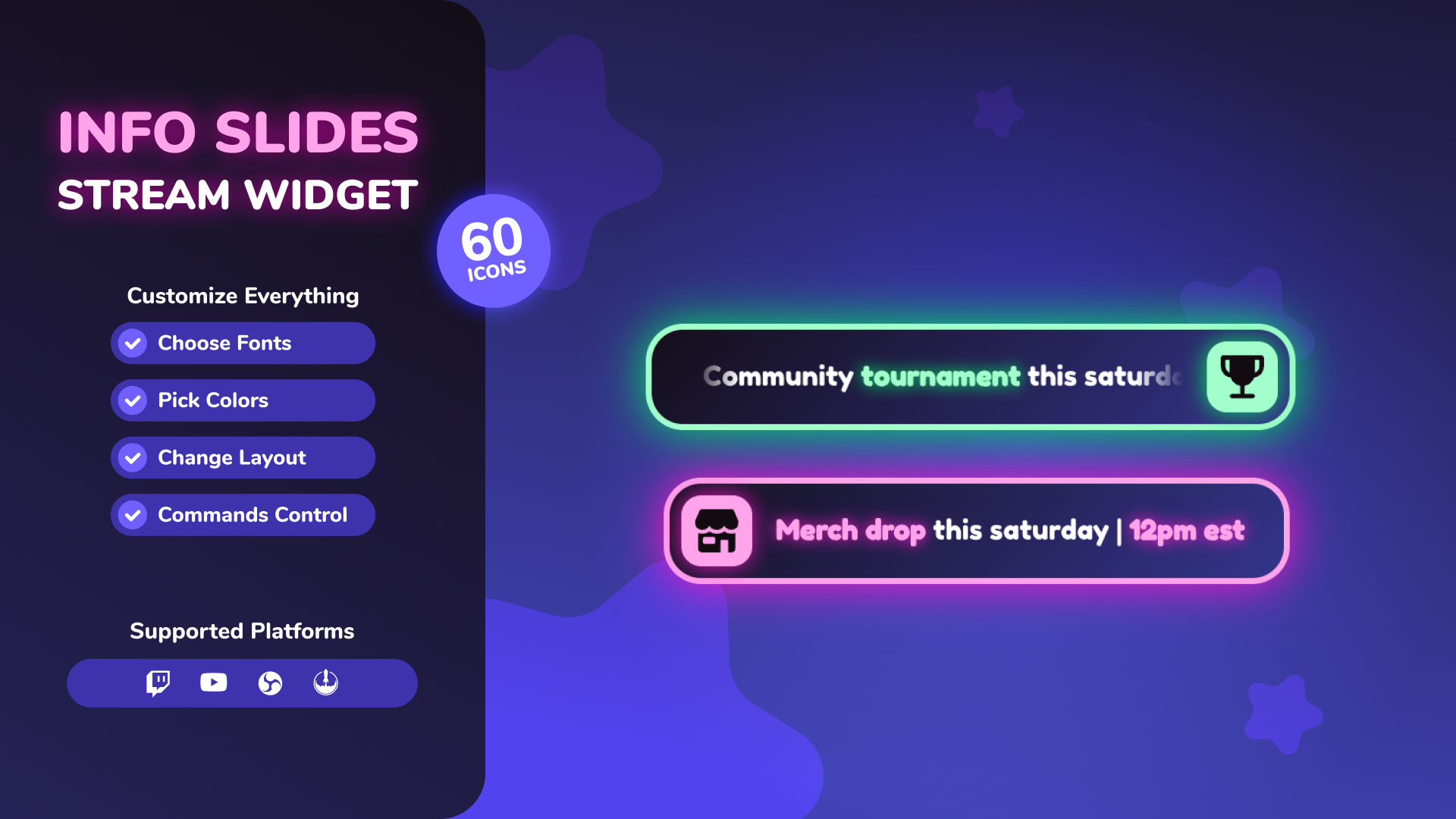
Info Slides Widget
Thanks for downloading our widget!
Here you will find instructions on how to set everything up and an in-depth description of its possibilities.
⚠️ Take note: This widget is hosted on StreamElements and works only with Twitch
Widget Installation
- Log in to StreamElements with your Youtube or Twitch account
- Go to the “2. Widget” folder in the package you’ve downloaded
-
Pick the file that corresponds to your streaming platform (Twitch or YouTube) and double-click to install it.
Voila! Your widget is installed!
Widget Customization
-
Pick your widget in your StreamElements dashboard and click “Edit”
-
Click on “Layers” and go to your widget.

- Go to the “Settings” tab


- Woohoo, here you can customize everything to your taste :)
⚠️ IMPORTANT
For all of your customizations to take effect, you need to press "Save" in the top right corner of the editor and refresh the page before adding the widget to your streaming software!

Customization Fields
⚙️ Slides Display
| Name | Description |
|---|---|
| Display Mode | Choose how the slides are displayed (Always Visible, Show/Hide on Chat Command, Show for X Seconds on Command, Loop All Slides on Command). |
| Transition Animation | Animation style when switching between slides (Fade, Slide Left, Slide Right, Slide Up, Slide Down, Flip, Zoom In, Zoom Out). |
| Hide All Icons | Toggle whether to hide all icons globally across slides. |
| Slides Command | The chat command to trigger the slides display (if not always visible). |
| Slides Command Permissions | Minimum permission level required to use the slides command.<br>• Twitch: Everyone, Subscriber+, VIPs+, Moderator+, Broadcaster Only.<br>• YouTube: Everyone, Member+, Moderator+, Broadcaster Only. |
| Time Per Slide (seconds) | How long each individual slide stays on screen. |
| Show Duration (seconds) | How long the entire widget stays visible when triggered (timed mode). |
| Number of Loops | Number of times to loop through all slides before hiding (loop mode). |
📢 Announcement
| Name | Description |
|---|---|
| Announce Command | The chat command used to trigger a custom announcement (default: !announce ). |
| Announce Command Permissions | Minimum permission level required to use the announce command.<br>• Twitch: Everyone, Subscriber+, VIPs+, Moderator+, Broadcaster Only.<br>• YouTube: Everyone, Member+, Moderator+, Broadcaster Only. |
| Announcement Appearance | How the announcement behaves relative to slides (Replace, Above, Below). |
| Show Duration (seconds) | How long the announcement stays visible before auto-hiding (0 for indefinite). |
1️⃣ Slide 1 to 5️⃣ Slide 5 (Individual Slide Settings)
| Name | Description |
|---|---|
| Show Slide | Toggle to enable or disable this specific slide. |
| Icon | Choose an icon from the built-in library, or select "Custom Icon". |
| Custom Icon Image | Upload a custom image to use as the icon. |
| Slide Text | Text to display on the slide (use \text\ to highlight). |
📏 Layout
| Name | Description |
|---|---|
| Widget Scale | Adjust the overall size of the widget. |
| Open Origin | Direction from which the widget animates in (Left, Right, Center). |
| Icon Alignment | Position of the icon container (Left, Right). |
| Scroll Long Text | Toggle horizontal marquee animation for text that exceeds the max width. |
| Scroll Max Width (px) | Maximum width of the text area before scrolling begins. |
| Icon Border Radius (%) | Adjust the roundness of the icon container (e.g. 50% for circle). |
| Background Border Radius (px) | Adjust the roundness of the main background card. |
| Background Stroke Width (px) | Adjust the thickness of the border stroke around the card. |
🎨 Slides Colors
| Name | Description |
|---|---|
| Icon Color | Color of the slide icon. |
| Icon Background | Background color behind the slide icon. |
| Text Color | Color of the regular slide text. |
| Highlight Text Color | Color of the highlighted slide text. |
| Background Color 1 | First color of the slide card background gradient. |
| Background Color 2 | Second color of the slide card background gradient. |
| Stroke Color | Color of the stroke/border around the slide card. |
🎨 Announcement Colors
| Name | Description |
|---|---|
| Icon Color | Color of the announcement icon. |
| Icon Background | Background color behind the announcement icon. |
| Text Color | Color of the regular announcement text. |
| Highlight Text Color | Color of the highlighted announcement text. |
| Background Color 1 | First color of the announcement card background gradient. |
| Background Color 2 | Second color of the announcement card background gradient. |
| Stroke Color | Color of the stroke/border around the announcement card. |
📝 Typography
| Name | Description |
|---|---|
| Font Family | The Google Font family used for all text layers. |
| Font Weight | Thickness of the regular text layers. |
| Highlight Font Weight | Thickness of the highlighted text layers. |
✨ Glow
| Name | Description |
|---|---|
| Slide Glow Color | Glow shadow color for the main slide card. |
| Slide Glow Blur (px) | Shadow blur radius for the main slide card. |
| Slide Icon Glow Color | Glow shadow color for the slide icon. |
| Slide Icon Glow Blur (px) | Shadow blur radius for the slide icon. |
| Slide Highlight Glow Color | Glow color behind highlighted words on slides. |
| Slide Highlight Glow Blur (px) | Glow blur behind highlighted words on slides. |
| Announcement Glow Color | Glow shadow color for the announcement card. |
| Announcement Glow Blur (px) | Shadow blur radius for the announcement card. |
| Announcement Icon Glow Color | Glow shadow color for the announcement icon. |
| Announcement Icon Glow Blur (px) | Shadow blur radius for the announcement icon. |
| Announce Highlight Glow Color | Glow color behind highlighted words on announcements. |
| Announce Highlight Glow Blur (px) | Glow blur behind highlighted words on announcements. |