
Cute Shoutout Widget

Thanks for downloading our widget!
Here you will find instructions on how to set everything up and an in-depth description of its possibilities.
⚠️ Take note: This widget is hosted on StreamElements and works only with Twitch
Widget Installation
- Log in to StreamElements with your Youtube or Twitch account
- Go to the “2. Widget” folder in the package you’ve downloaded
-
Pick the file that corresponds to your streaming platform (Twitch or YouTube) and double-click to install it.
Voila! Your widget is installed!
Widget Customization
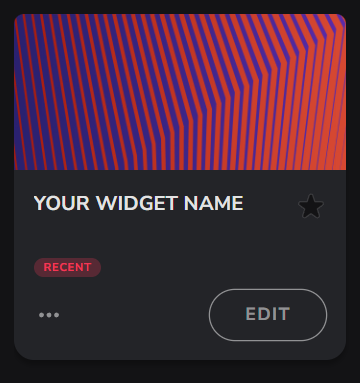
-
Pick your widget in your StreamElements dashboard and click “Edit”
-
Click on “Layers” and go to your widget.

- Go to the “Settings” tab


- Woohoo, here you can customize everything to your taste :)
⚠️ IMPORTANT
For all of your customizations to take effect, you need to press "Save" in the top right corner of the editor and refresh the page before adding the widget to your streaming software!

🎯 How It Works
Cute Shoutout Widget is a customizable overlay that showcases streamers you want to highlight to your audience. It displays their profile picture, username, current game, stream title, and live status in a beautiful, animated card format.
Widget Modes
The widget has three modes to fit different streaming styles:
Manual Mode - Command-Based Shoutouts
You have complete control over when shoutouts appear. When authorized users type the command in chat, the widget instantly displays that streamer's information. This is perfect for:
- Shouting out raiders who just joined your stream
- Highlighting friends who are supporting you in chat
- Featuring special guests or collaborators
You can customize who is allowed to use the manual command, from everyone to broadcaster-only.
Automatic Mode - Hands-Free Community Support
Create a "watch list" of streamers you want to support automatically. The widget monitors these streamers and shows shoutouts when they:
- Go Live: Widget detects when they start streaming and shows a shoutout
- Chat in Your Stream: Widget shows a shoutout when they visit and chat with you
This mode is ideal for streamers who want to support their community without interrupting their gameplay or content.
Both Mode - Best of Both Worlds
Combines manual commands with automatic detection, giving you maximum flexibility to support your community however feels natural in the moment.
Understanding Cooldowns (Automatic Mode Only)
Cooldowns prevent the same streamer from being featured repeatedly, ensuring variety and preventing your overlay from being dominated by one person.
- Live Trigger Cooldown: Prevents the same streamer from getting automatic shoutouts too frequently when they go live. This helps if someone has connection issues and goes live/offline repeatedly.
- Chat Trigger Cooldown: Prevents the same active community member from getting featured every time they chat in your stream.
Important: Manual shoutouts (using the command) are never affected by cooldowns - you can always manually shout out anyone at any time!
Duration Settings
You can set how long shoutouts remain on screen separately for manual and automatic triggers, allowing you to give more prominence to certain types of shoutouts.
Visual Customization
The widget offers extensive visual customization across several categories:
- Typography: Choose from Google Fonts and adjust text sizes for all elements
- Layout & Styling: Control profile picture size, card roundness, border widths, and layout orientation
- Colors: Customize text colors, backgrounds, borders, and effects
- Visual Effects: Enable glow effects, drop shadows, animated decorations, and sparkle effects
- Content Display: Choose which information to show (game title, stream title) and customize the shoutout label
Testing Mode
Enable Testing Mode to preview the widget using your own channel's data. This is perfect for testing visual configurations before going live and verifying how your information will appear.
Customization Fields
🔧 Basic Setup
| Name | Description |
|---|---|
| Testing Mode (Shows Your Channel) | Toggle testing mode to display your own channel's profile and details on the screen for layout checking. |
| Widget Mode | Choose between Manual Shoutouts Only, Automatic Shoutouts Only, or Both. |
💬 Manual Commands
| Name | Description |
|---|---|
| Manual Command | The chat command viewers/mods type to trigger a manual shoutout (e.g., !shoutout ). |
| Who Can Use Manual Command | Choose the permission level required to run the manual command (everyone, subscriber, vip, moderator, or broadcaster only). |
| Manual Shoutout Duration (seconds) | How long a manual shoutout stays on screen before hiding. |
🤖 Automatic Triggers
| Name | Description |
|---|---|
| Automatic Shoutout Users (comma separated) | A comma-separated list of Twitch usernames to automatically shout out when they trigger the widget. |
| Automatic Trigger | Choose when automatic shoutouts occur: when a user goes live, when they chat, or both. |
| Automatic Shoutout Duration (seconds) | How long an automatic shoutout stays on screen before hiding. |
| Live Trigger Cooldown (minutes) | Cooldown duration between live notifications for the same user. |
| Chat Trigger Cooldown (hours) | Cooldown duration between chat notifications for the same user. |
📝 Content & Display
| Name | Description |
|---|---|
| Shoutout Label (above name) | The introduction label text shown above the streamer's name (e.g., “Say hi to”). |
| Show Game Title | Toggle displaying the last played game of the shouted-out user. |
| Show Stream Title | Toggle displaying the current stream title of the shouted-out user in a scrolling marquee. |
🔤 Typography
| Name | Description |
|---|---|
| Font Family | The Google Font family used for all text layers in the widget. |
| Shoutout Label Size (px) | Font size of the intro/shoutout label text. |
| Streamer Name Size (px) | Font size of the streamer's username. |
| Game Title Size (px) | Font size of the game title text inside its pill. |
| Stream Title Size (px) | Font size of the stream title inside its scrolling wrapper. |
| Live Indicator Size (px) | Font size of the "LIVE" badge text. |
📐 Layout & Styling
| Name | Description |
|---|---|
| Background Card Corner Roundness | Corner roundness of the main shoutout card in pixels. |
| Profile Picture Roundness | Corner roundness of the profile picture in percentage (e.g. 50% for circle). |
| Card Stroke Width | Border thickness of the main shoutout card in pixels. |
| Profile Picture Border Width | Border thickness of the profile picture container in pixels. |
| Profile Picture Size (px) | Width and height of the profile picture container in pixels. |
🎨 Text Colors
| Name | Description |
|---|---|
| Title Text Color | Color of the intro label text. |
| Username Color | Color of the streamer's username. |
| Game Text & Icon Color | Color of the game title text and its gamepad icon. |
| Stream Title Color | Color of the stream title text. |
| Live Indicator Color | Color of the "LIVE" indicator badge text. |
🎨 Background Colors
| Name | Description |
|---|---|
| Card Background Color | Background fill color of the main shoutout card. |
| Stream Title Background | Background color of the stream title's rounded marquee pill. |
| Game Background Color | Background color of the game title's rounded pill. |
🎨 Border Colors
| Name | Description |
|---|---|
| Card Border Start Color | The starting color of the card's gradient border. |
| Card Border End Color | The ending color of the card's gradient border. |
| Profile Border Start Color | The starting color of the profile container's gradient ring. |
| Profile Border End Color | The ending color of the profile container's gradient ring. |
🎨 Effect Colors
| Name | Description |
|---|---|
| Glow & Shadow Color | Main color used for the glows and drop shadows when enabled. |
| Sparkle Color | Color of the decorative pulsing stars on the card. |
✨ Glow Effects
| Name | Description |
|---|---|
| Enable Card Glow | Toggle a colored outer glow around the main card on or off. |
| Enable Profile Picture Glow | Toggle a colored outer glow around the profile picture container on or off. |
| Enable Username Glow | Toggle a text shadow glow behind the username text on or off. |
| Enable Card Drop Shadow | Toggle a subtle shadow below the main card on or off. |
| Enable Profile Drop Shadow | Toggle a subtle shadow below the profile picture container on or off. |
✨ Visual Effects
| Name | Description |
|---|---|
| Enable Blob Clouds | Toggle the background decorative blob graphics on or off. |
| Enable Sparkle Stars | Toggle the overlay pulsing sparkle stars on or off. |
| Animation Duration (seconds) | Duration of the card's entrance and exit transition animations. |