
Date & Time

Thanks for downloading our widget!
Here you will find instructions on how to set everything up and an in-depth description of its possibilities.
⚠️ Take note: This widget is hosted on StreamElements and works only with StreamElements donations — make sure you have a StreamElements account before setting it up!
Widget Installation
- Log in to StreamElements with your Youtube or Twitch account
- Go to the “2. Widget” folder in the package you’ve downloaded
-
Pick the file that corresponds to your streaming platform (Twitch or YouTube) and double-click to install it.
Voila! Your widget is installed!
Widget Customization
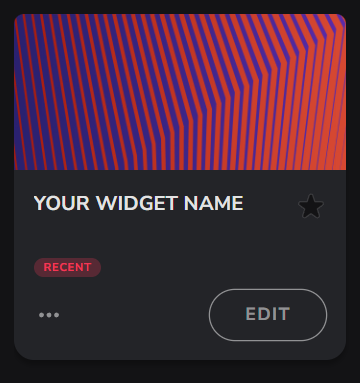
-
Pick your widget in your StreamElements dashboard and click “Edit”
-
Click on “Layers” and go to your widget.

- Go to the “Settings” tab


- Woohoo, here you can customize everything to your taste :)
⚠️ IMPORTANT
For all of your customizations to take effect, you need to press "Save" in the top right corner of the editor and refresh the page before adding the widget to your streaming software!

Customization Fields
Time & Date Settings
| Name | Description |
|---|---|
| Time Format | Choose between 12-hour (AM/PM) or 24-hour clock display. |
| Timezone | Set your local timezone so the clock always shows the correct time for your region. |
| Show Seconds | Toggle the seconds display on or off. |
| Date Format | Choose how the date is displayed — with or without the day name, and with or without the year. |
| Language | Set the language for day and month names. Supports English, Spanish, French, German, Italian, Portuguese, Polish, Ukrainian, Japanese, Korean, and Chinese. |
| Swap Date and Time Position | Flip the layout so the date appears above the time instead of below. |
Typography Settings
| Name | Description |
|---|---|
| Font Family | Pick any Google Font to match your stream's style. |
| Time Font Size (px) | Set the size of the clock digits. |
| Date Font Size (px) | Set the size of the date text. |
| AM/PM Size | Choose whether the AM/PM label is small (subtle) or matches the clock size. |
Theme & Colors Settings
| Name | Description |
|---|---|
| Theme | Choose a visual theme for the widget's decorative elements. Options include Default, Clouds, Cats, Flowers, Stars, and Ribbons. |
| Use Theme Colors | Let the selected theme automatically apply its matching color palette. Disable to set your own custom colors. |
| Background Color | Set the background color of the widget box. Active when "Use Theme Colors" is off. |
| Border Color | Set the color of the widget's border outline. Active when "Use Theme Colors" is off. |
| Time Text Color | Set the color of the clock digits. Active when "Use Theme Colors" is off. |
| Date Text Color | Set the color of the date text inside the date capsule. Active when "Use Theme Colors" is off. |
| Date Capsule Color | Set the background color of the date capsule. Active when "Use Theme Colors" is off. |
| Use Theme Colors for Decorations | Let the selected theme automatically color the decorative animated elements. Disable to set custom decoration colors. |
| Decoration Color 1 | Set the first custom color for the decorative elements. Active when "Use Theme Colors for Decorations" is off. |
| Decoration Color 2 | Set the second custom color for the decorative elements. Active when "Use Theme Colors for Decorations" is off. |
| Decoration Color 3 | Set the third custom color for the decorative elements. Active when "Use Theme Colors for Decorations" is off. |
| Enable Glow Effect | Add a soft glow around the widget for a more stylized look. |
| Glow Color | Set the color of the glow. Active when "Enable Glow Effect" is on. |
| Glow Intensity (px) | Control how strong the glow appears. Higher values create a more dramatic effect. Active when "Enable Glow Effect" is on. |
Shape Settings
| Name | Description |
|---|---|
| Horizontal Margin from Border (px) | Set the space between the content and the left/right edges of the widget box. |
| Vertical Margin from Border (px) | Set the space between the content and the top/bottom edges of the widget box. |
| Border Width (px) | Set the thickness of the widget's border outline. Use 0 to hide the border. |
| Corner Roundness (px) | Adjust how rounded the corners of the widget box are. Higher values create a pill or circular shape. |
| Date Capsule Roundness (px) | Adjust how rounded the corners of the date capsule are. |
Animations Settings
| Name | Description |
|---|---|
| Clock Change Animation | Choose how the clock digits animate each time they update. Options: No animation, Pop, Slide Up, Slide Down, Fade & Blur, or Flip. |
| Clock Animation Speed | Control how fast the clock digit animation plays. Lower values are slower; higher values are snappier. Active when an animation style is selected. |
| Test Clock Animation | Preview the selected animation immediately without waiting for the clock to update. |
⚠️ IMPORTANT
For all of your customizations to take effect, you need to press "Save" in the top right corner of the editor and refresh the page before adding the widget to your streaming software!
How to Add it to the Streaming Software?
OBS Studio
- Copy the URL of your Widget from the StreamElements dashboard
- Open OBS Studio
- Click “Add Source” (plus icon) in the Sources section.
- Add a “Browser” source, give it a name, and press “Ok”
- Paste the URL you’ve copied
- Set the width to 1920 and the height to 1080
- Press “Ok” and we’re done!
Streamlabs Desktop
- Copy the URL of your Widget from the StreamElements dashboard
- Open Streamlabs Desktop
- Click “Add a new Source” (plus icon) in the Sources section.
- Choose “Browser Source”, give it a name, and press “Add Source”.
- Paste the URL you’ve copied previously
- Set the width to 1920 and the height to 1080
- Now press “Close” and that’s it! Your widget is ready to use!