
Collectible Card Battle Game

Thanks for downloading our widget!
Here you will find instructions on how to set everything up and an in-depth description of its possibilities.
⚠️ Take note: This widget is hosted on StreamElements and works only with StreamElements donations — make sure you have a StreamElements account before setting it up!
Widget Installation
- Log in to StreamElements with your Youtube or Twitch account
- Go to the “2. Widget” folder in the package you’ve downloaded
-
Pick the file that corresponds to your streaming platform (Twitch or YouTube) and double-click to install it.
Voila! Your widget is installed!
Widget Customization
-
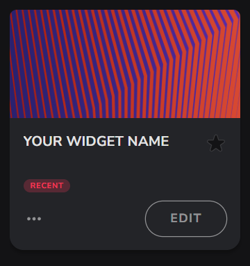
Pick your widget in your StreamElements dashboard and click “Edit”
-
Click on “Layers” and go to your widget.

- Go to the “Settings” tab


- Woohoo, here you can customize everything to your taste :)
⚠️ IMPORTANT
For all of your customizations to take effect, you need to press "Save" in the top right corner of the editor and refresh the page before adding the widget to your streaming software!

Customization Fields
Settings
| Name | Description |
|---|---|
| Font Family | Primary Google Font used across the widget. |
| Font Weight | Font thickness used on labels and UI text. |
| Text Size | Base text size for labels and overlays. |
| Primary Theme Color | Accent color applied to UI elements. |
| Border and Secondary Color | Secondary color used for strokes and UI accents. |
| Card Border Thickness | Inner stroke thickness around the main card (in pixels). |
| Card Image Scale | Zoom level for the card artwork (percent). |
| Collection Back Image | Image shown for unrevealed/locked cards in the collection grid. |
| Card Pack Graphic | Image used inside the opening pack intro. |
| Display Card Name | Toggle visibility of the card name overlay. |
| Display Card Rarity (Stars) | Toggle visibility of star rarity overlay. |
| Sound Effect Volume | Volume for card/battle SFX. |
Card Library
| Name | Description |
|---|---|
| Number of Cards in Set | Total cards in the collection (up to 48). Controls layout spacing. |
| Holographic Effect Minimum Stars | Minimum star rating for applying the holo effect. |
| Card N Image | Artwork for card N. |
| Card N Name | Display name for card N. |
| Card N Drop Chance (%) | Probability weight for drawing card N. |
| Card N Stars (1–5) | Rarity value for card N shown as stars. |
Chat Commands
| Name | Description |
|---|---|
| Command to Start Battle | Chat command that starts a battle challenge. |
| Command to Accept Battle | Chat command that accepts an active battle challenge. |
Permissions
| Name | Description |
|---|---|
| Who can use commands? | Restricts who can trigger commands via chat. Platform‑specific roles are honored. |
Timing & Testing
| Name | Description |
|---|---|
| Card Display Duration (seconds) | Time each revealed card remains in focus before transitioning. |
| Collection View Duration (seconds) | Time the collection grid is shown during reveal flow. |
| Time Between Cards (seconds) | Delay between queued card/battle jobs. |
| Battle Countdown Duration (seconds) | Visible countdown before a battle sequence starts. |
| Activate Automatic Card Drawing | Test mode: continuously queue card draws. |
| Activate Automatic Battle Testing | Test mode: continuously run battle sequences. |
Commands (All Available) + Examples
| Command | What it does | Example usage in chat |
|---|---|---|
| Command to Draw a Card | Queues a single card reveal for the user. | If set to !draw , viewers type: !draw |
| Command to View Collection | Shows the user’s collection grid. | If set to !collection , viewers type: !collection |
| Command to Start Battle | Starts a battle challenge from the user. | If set to !battle , viewers type: !battle |
| Command to Accept Battle | Accepts a pending battle challenge. | If set to !accept , viewers type: !accept |
| Moderator Reset (All) | Clears everyone’s stored collection data. | Moderators type: !reset all |
| Moderator Reset (Single) | Clears a specific user’s stored collection data. | Moderators type: !reset <username> |
Custom Image Guidelines (Resolution)
| Asset | Purpose | Recommended details |
|---|---|---|
| Card Pack Graphic | Image masked inside the pack intro SVG (clip path 490×634). | Use at least 490×634 px (same aspect ratio). Higher‑res allowed for sharper results. PNG/JPG. |
| Collection Back Image | Back face for unrevealed cards in the collection grid. | Use a portrait image matching your card aspect ratio. Recommend ≥ 800 px on the long side. PNG with transparency supported. |
| Card N Image (per card) | Main artwork for each card. | Use consistent aspect ratio across all cards. Recommend high‑res (≥ 1000 px on long side). Prefer PNG with transparency to integrate with holo/lighting. |
General tips:
- Keep file sizes moderate to avoid stutter during reveals (optimize PNGs/JPGs).
- Use consistent aspect ratio across the entire set for the cleanest grid layout.
⚠️ IMPORTANT
For all of your customizations to take effect, you need to press "Save" in the top right corner of the editor and refresh the page before adding the widget to your streaming software!
How to Add it to the Streaming Software?
OBS Studio
- Copy the URL of your Widget from the StreamElements dashboard
- Open OBS Studio
- Click “Add Source” (plus icon) in the Sources section.
- Add a “Browser” source, give it a name, and press “Ok”
- Paste the URL you’ve copied
- Set the width to 1920 and the height to 1080
- Press “Ok” and we’re done!
Streamlabs Desktop
- Copy the URL of your Widget from the StreamElements dashboard
- Open Streamlabs Desktop
- Click “Add a new Source” (plus icon) in the Sources section.
- Choose “Browser Source”, give it a name, and press “Add Source”.
- Paste the URL you’ve copied previously
- Set the width to 1920 and the height to 1080
- Now press “Close” and that’s it! Your widget is ready to use!