
Horizontal Cute Kawaii Chat Widget

Thanks for downloading our widget!
Here you will find instructions on how to set everything up and an in-depth description of its possibilities.
⚠️ Take note: This widget is hosted on StreamElements and works only with StreamElements donations — make sure you have a StreamElements account before setting it up!
Widget Installation
- Log in to StreamElements with your Youtube or Twitch account
- Go to the “2. Widget” folder in the package you’ve downloaded
-
Pick the file that corresponds to your streaming platform (Twitch or YouTube) and double-click to install it.
Voila! Your widget is installed!
Widget Customization
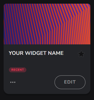
-
Pick your widget in your StreamElements dashboard and click “Edit”
-
Click on “Layers” and go to your widget.

- Go to the “Settings” tab


- Woohoo, here you can customize everything to your taste :)
Customization Options
⚠️ IMPORTANT
For all of your customizations to take effect, you need to press "Save" in the top right corner of the editor and refresh the page before adding the widget to your streaming software!

Design Settings
The Design Settings section allows you to personalize various aspects of your widget's appearance. From adjusting text features to modifying graphic details, these settings enable you to create a visually cohesive and appealing chat that fits to your stream aesthetics.
| Name | Description |
|---|---|
| Show Badges | Enable/Disable badges beside usernames. |
| Hide Star | Hide the star/custom icon displayed next to messages. |
| Distance Between Messages | Spacing (in pixels) between individual chat messages. |
| Max Message Width (px) | Maximum width (in pixels) a single message can occupy. |
| Font Name | Google Font to use for all chat text. |
| Username Font Weight | Font weight for usernames (e.g. Normal, Bold, Extra Bold). |
| Message Font Weight | Font weight for the message text. |
| Font Size | General font size (in pixels) for chat text. |
| Star Color | Color for the default star icon. |
| Select Icon | Default “Star” or “Custom Icon.” |
| Custom Icon | Upload your own image for the icon next to messages. |
| Graphic Outline Color | Outline color of the star/custom icon. |
| Graphic Outline Size | Thickness (in pixels) of the star/custom icon outline. |
| Message Text Color | Color for the message text. |
| Message Background Color | Background color for message bubbles. |
| Message Corner Roundness | Corner radius (in pixels) for message bubbles. |
| Message Shadow Size | Shadow offset (in pixels) for message bubbles. |
| Message Shadow Color | Shadow color for message bubbles. |
| Message Outline Size | Border thickness (in pixels) for message bubbles. |
| Message Outline Color | Border color for message bubbles. |
| Use Twitch Name Color | If enabled, usernames use their Twitch-assigned chat color. |
| Name Text Color | Username text color (if ‘Use Twitch Name Color’ is off). |
| Name Background Color | Background color for the username display area. |
| Name Corner Roundness | Corner radius (in pixels) for the username display area. |
| Name Shadow Size | Shadow offset (in pixels) for usernames. |
| Name Shadow Color | Shadow color for usernames. |
| Name Outline Size | Border thickness (in pixels) for usernames. |
| Name Outline Color | Border color for usernames. |
Behaviour Settings
The Behavior Settings section provides options to control how your chat widget interacts with user input and manages message visibility. These settings are crucial for maintaining the desired atmosphere in your chat and stream.
| Name | Description |
|---|---|
| Message Flow Direction | ‘Appear Right (Push Left)’ or ‘Appear Left (Push Right)’. |
| Use Blocklist As Allowlist | If enabled, the Block/Allow List becomes an allowlist (only listed users appear). |
| Block/Allow List | Usernames to block (or allow, if above is on), comma-separated. |
| Hide Message Time (sec) | Duration (in seconds) before messages fade out. 0 = never. |
| Ignore Commands | Don’t display messages that start with the Command Symbol. |
| Command Symbol (To Ignore) | Character (e.g. ! ) that marks commands to be ignored. |
Testing
This section offers a straightforward option for checking the functionality and appearance of your widget:
| Name | Description |
|---|---|
| Enable Testing | Toggle this to display test messages, allowing you to preview and adjust the widget's behavior and appearance before going live. |
Size and Opacity
- Open “Position, size and style” menu

- Change height, width, and opacity to your liking
⚠️ IMPORTANT
For all of your customizations to take effect, you need to press "Save" in the top right corner of the editor and refresh the page before adding the widget to your streaming software!
How to Add it to the Streaming Software?
OBS Studio
- Copy the URL of your Widget from the StreamElements dashboard
- Open OBS Studio
- Click “Add Source” (plus icon) in the Sources section.
- Add a “Browser” source, give it a name, and press “Ok”
- Paste the URL you’ve copied
- Set the width to 1920 and the height to 1080
- Press “Ok” and we’re done!
Streamlabs Desktop
- Copy the URL of your Widget from the StreamElements dashboard
- Open Streamlabs Desktop
- Click “Add a new Source” (plus icon) in the Sources section.
- Choose “Browser Source”, give it a name, and press “Add Source”.
- Paste the URL you’ve copied previously
- Set the width to 1920 and the height to 1080
- Now press “Close” and that’s it! Your widget is ready to use!