
Cute Socials Widget

Thanks for downloading our Cute Socials Widget
Here you will find instructions on how to set everything up and an in-depth description of its possibilities.
⚠️ Take note: This widget is hosted on StreamElements and works only with StreamElements donations — make sure you have a StreamElements account before setting it up!
Setup Guide
- Log in to StreamElements with your Youtube or Twitch account
- Go to the “2. Widget” folder in the package you’ve downloaded
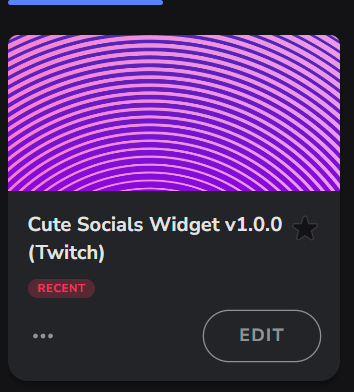
-
Pick the file that corresponds to your streaming platform (Twitch or YouTube) and double-click to install it.
Voila! Your widget is installed!
Widget Customization
-
Pick your widget in your StreamElements dashboard and click “Edit”
-
Click on “Layers” and go to “ Cute Socials Widget”

- Go to the “Settings” tab


- Woohoo, here you can customize everything to your taste :)

Customization Options
⚠️ IMPORTANT
For all of your customizations to take effect, you need to press "Save" in the top right corner of the editor and refresh the page before adding the widget to your streaming software!

Customization Fields
Display Settings
| Name | Description |
|---|---|
| Display Mode | Choose between Automatic Popup, Command Triggered, or Always Visible modes. |
| Hidden Duration (seconds) | Time in seconds between widget appearances in Automatic Popup mode (e.g., 300 for 5 minutes). |
| Card Rotation Speed (seconds) | Time in seconds each card stays in front before rotating. |
| Visible Background Cards | Number of cards shown stacked behind the active card, including the front card. |
Layout Settings
| Name | Description |
|---|---|
| Icon Position | Choose to position the icon on the left or right side of the card. |
| Text Alignment | Align text on cards: Left, Center, or Right. |
Typography Settings
| Name | Description |
|---|---|
| Main Font | Select the font used for all text on cards. |
| Username Font | Select the font used for usernames. |
| Supporting Text Size | Set the font size for supporting text (e.g., labels). |
| Username Text Size | Set the font size for usernames. |
| Supporting Text Color | Pick the color for supporting text. |
| Username Text Color | Pick the color for usernames. |
| Username Shadow Color | Pick the color of the shadow behind usernames. |
Card Styling
| Name | Description |
|---|---|
| Card Gradient ‑ Color 1 | First color stop for card background gradient. |
| Card Gradient ‑ Color 2 | Second color stop for card background gradient. |
| Card Corner Radius | Adjust how rounded each card’s corners are. |
| Card Border Weight | Set the thickness of the card border in pixels. |
| Card Border Color | Pick the color of the card border. |
Icon Styling
| Name | Description |
|---|---|
| Icon Color | Pick the color of the icons on cards. |
| Icon Background Color | Pick the background color behind icons. |
| Icon Corner Radius | Adjust how rounded the icon backgrounds are. |
| Icon Border Weight | Set the thickness of the icon border in pixels. |
| Icon Border Color | Pick the color of the icon border. |
Social Card 1 Settings
| Name | Description |
|---|---|
| Icon Type | Select the social icon for this card (e.g., Twitter, Instagram, or Custom Upload). |
| Custom Icon | Upload a custom image when using Custom Upload. |
| Supporting Text | Text prompt or call‑to‑action for this card. |
| Username/Handle | Enter your username or handle for this social platform. |
Social Card 2 Settings
| Name | Description |
|---|---|
| Icon Type | Select the social icon for this card (e.g., Twitter, Instagram, or Custom Upload). |
| Custom Icon | Upload a custom image when using Custom Upload. |
| Supporting Text | Text prompt or call‑to‑action for this card. |
| Username/Handle | Enter your username or handle for this social platform. |
Social Card 3 Settings
| Name | Description |
|---|---|
| Icon Type | Select the social icon for this card (e.g., Twitter, Instagram, or Custom Upload). |
| Custom Icon | Upload a custom image when using Custom Upload. |
| Supporting Text | Text prompt or call‑to‑action for this card. |
| Username/Handle | Enter your username or handle for this social platform. |
Social Card 4 Settings
| Name | Description |
|---|---|
| Icon Type | Select the social icon for this card (e.g., Twitter, Instagram, or Custom Upload). |
| Custom Icon | Upload a custom image when using Custom Upload. |
| Supporting Text | Text prompt or call‑to‑action for this card. |
| Username/Handle | Enter your username or handle for this social platform. |
Social Card 5 Settings
| Name | Description |
|---|---|
| Icon Type | Select the social icon for this card (e.g., Twitter, Instagram, or Custom Upload). |
| Custom Icon | Upload a custom image when using Custom Upload. |
| Supporting Text | Text prompt or call‑to‑action for this card. |
| Username/Handle | Enter your username or handle for this social platform. |
Command Settings
| Name | Description |
|---|---|
| Widget Command | Chat command to toggle or display the widget (e.g., !socials). |
| Command Permissions | Choose who can use the widget command (Everyone, Subscribers, VIPs, Moderators, Broadcaster). |
⚠️ IMPORTANT
For all of your customizations to take effect, you need to press "Save" in the top right corner of the editor and refresh the page before adding the widget to your streaming software!
How to Add it to the Streaming Software?
OBS Studio
- Copy the URL of your Widget from the StreamElements dashboard
- Open OBS Studio
- Click “Add Source” (plus icon) in the Sources section.
- Add a “Browser” source, give it a name, and press “Ok”
- Paste the URL you’ve copied
- Set the width to 1920 and the height to 1080
- Press “Ok” and we’re done!
Streamlabs Desktop
- Copy the URL of your Widget from the StreamElements dashboard
- Open Streamlabs Desktop
- Click “Add a new Source” (plus icon) in the Sources section.
- Choose “Browser Source”, give it a name, and press “Add Source”.
- Paste the URL you’ve copied previously
- Set the width to 1920 and the height to 1080
- Now press “Close” and that’s it! Your widget is ready to use!